
Fashion! basically shakes down like this: Every Friday, my feminine side and I get together and discuss the uniforms for each team in one of the eight groups featuring at the tournament next month. At the end of each discussion, the jersey in question will be scored between 0 and 5 on the Tshabalala Scale. This week, we tackle Group A.
 South Africa
ZGS: This jersey is awesome.
Feminine Side: The detailing is fantastic and the color scheme is eye catching, but not garish.
ZGS: It looks like one of those awesome rainforest frogs. You know, the kind who's skin tells predators "Don't eat me, 'cause I'll make you log on to vom.com?"
FS: Umm. Yes. It's definitely bold. If I had one complaint, it would be the matte yellow cutout on both of the sleeves.
ZGS: You mean how the stripes don't go all the way?
FS: Sure. If that's how you want to describe it.
ZGS: If you were in South Africa, how much would you pay a street vendor for a decent Indonesian knock-off?
FS: 150 Rand.
ZGS: Booyah! I officially give this jersey 4 out of 5 Tshabalalas.
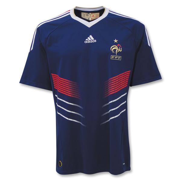 France
FS: It's hard for me not to like something French.
ZGS: Well, it's easy for me. This shit looks stupid.
FS: Really?
ZGS: Totally. First off, the blue is way too dark.
FS: I think it offsets the other colors quite nicely.
ZGS: You would. It's not TERRIBLE, but the only thing sweet about this jersey is the crest.
FS: I will admit, the graphic elements on the front leave a bit to be desired.
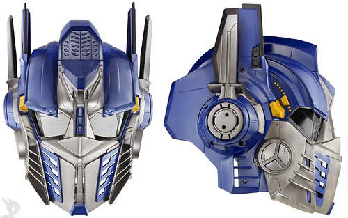
ZGS: It looks like the grill on Optimus Prime's helmet.
FS: I don't even know what that means.
ZGS: Shabazz! I officially give this jersey 2 out of 5 Tshabalalas.
 Uruguay
ZGS: First glance, boring. There's nothing really wrong with it, it's just boring.
FS: It's an attractive color, but I agree, it needs something more.
ZGS: I don't like the mesh sleeves.
FS: I don't like mesh anything.
ZGS: The subtle, printed sun pattern is cool, but tough to see.
FS: It's from their national flag.
ZGS: I know. Maybe you don't remember, but I won the 6th, 7th AND 8th Grade Geography Bees at our school.
FS: I wish I could forget.
ZGS: Chaka Khan! I officially give this jersey 3 out of 5 Tshabalalas.
 Mexico
ZGS: Zero out of five. I don't even need to see it to know that.
FS: Si, claro.
ZGS: I mean, I see what's they're trying to do. The pattern is all Aztec and feathers and shit.
FS: Mesoamerican culture is SO Pre-Colombian. In a bad way.
ZGS: I just hate it on principle.
FS: If there's any silver lining here, it's that Blanco's head will look extra fat and square sticking out of that high neck-line.
ZGS: Thank god for small things.
FS: Si, claro.
ZGS: Razzmatazz! I officially give this shirt 0 out of 5 Tshabalalas.
all these jersey's are hideous except the french one IMO
ReplyDeleteAll these Jerseys suck.
ReplyDeleteThe French jersey is just strange.The Uruguay jersey clearly deserves 5 out of 5 Tshabalalas. I want one.
ReplyDeleteYou should post a picture of the German jersey and then discuss why it looks so MILITARISTIC!
ReplyDeletePlease accept my apologies for my stupid French cousin who knows nothing about soccer OR fashion. He is jealous. And stupid. Greece has the best jersey for 2010, but at 48.55 Euros each they will have to sell approximately 2.26 billion to pay back the loan they just got from the rest of Europe!
ReplyDeleteSouth Africa looks exactly like Australia's old shirt, colors and all. Of course the new Australia shirt looks very beer league. I can't wait to see you eviscerate that one.
ReplyDeleteAnd I agree the Mexican shirt looks terrible but have you seen how cute their players are (Blanco aside of course)?